Nowadays web traffic from mobile devices is really high. Thus we need to make sure our pages are respectively designed (see Responsive Web Design). Most common practice here is to hide/replace page layout parts on smaller screens and change the display flow direction depending on screen size. Below we are going to see how easy to test RWD-related specs with Puppetry.
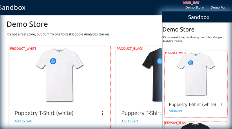
Our page under test consists mainly from navigation bar and product listing. On wider screens it shows products cards aligned horizontally. On mobile devices they are aligned vertically. Besides, on mobile the main navigation menu is hidden. In order to test this behavior we define our targets: at least two product cards and the main menu container.
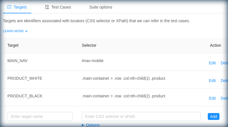
Now we can create a new test suite in Puppetry, switch to the Targets tab and introduce our target elements as name = CSS selector.
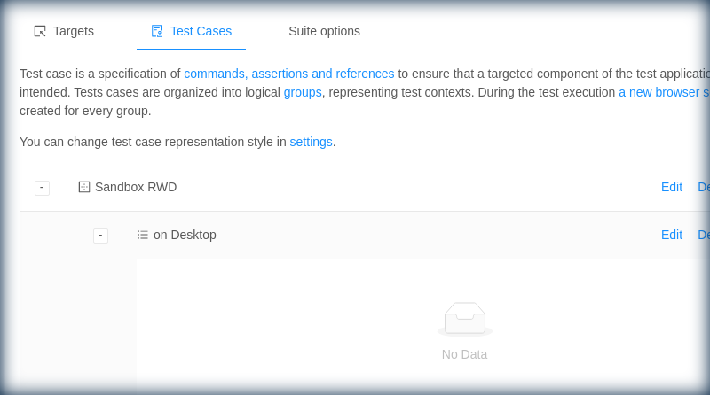
Then we jump to Test cases tab, create group "Sandbox RWD" and the first test "On Desktop".
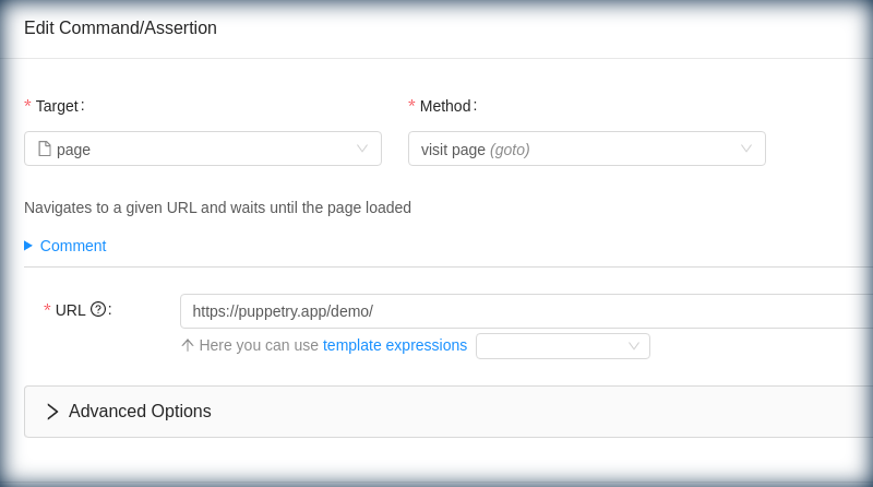
First we need to instruct Puppetry to navigate the page under test. So we click "Add a command/assertion", select target "page" and method "goto". It shows up a form where we enter the test page URL
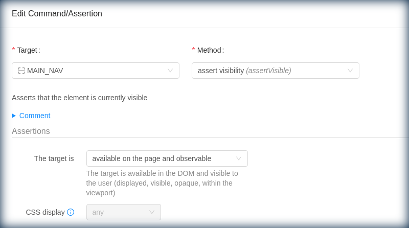
Next we want to ensure that main menu (container) is available and visible on wider screens. We click "Add a command/assertion", select target "MAIN_NAV" (one of targets we have registered) and method "assertVisible". We confirm the default assertion "The target is available and observable on the page".
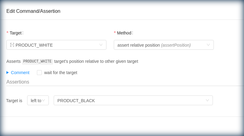
We want also to test that product cards are aligned horizontally. We click "Add a command/assertion", select target "PRODUCT_WHITE" (one of targets we have registered) and method "assertPosition".
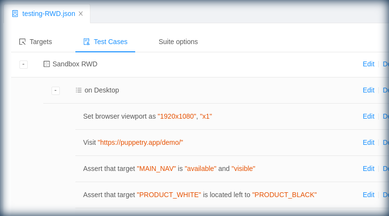
Now the test has to have all the steps we added
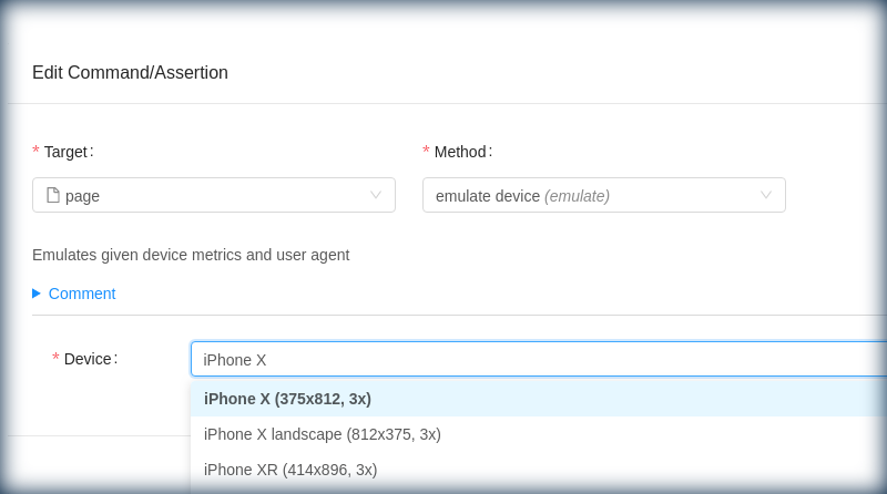
We create a new test case "on iPhone X". This time we start with page.emulate action. Thus we inform Puppetry that we want it to render the page with iPhone X emulator
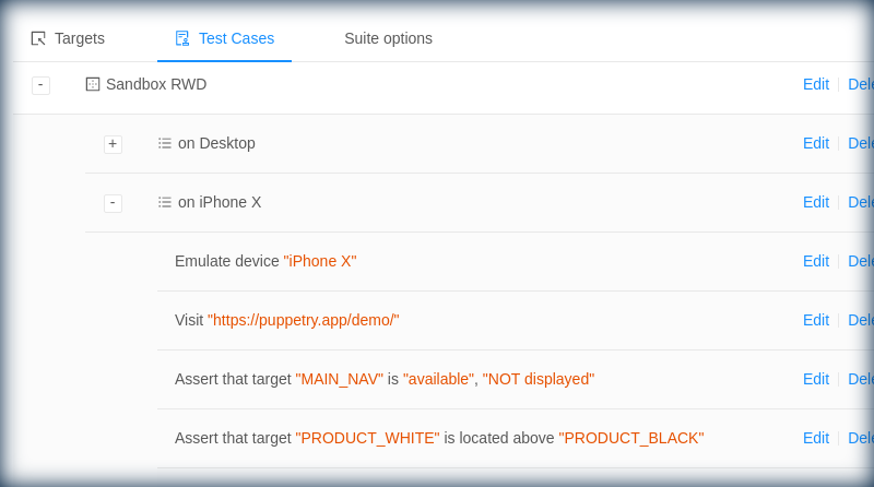
Pretty much the same way as above we add actions to navigate to the test page and assert availability of main menu and positions of product cards.
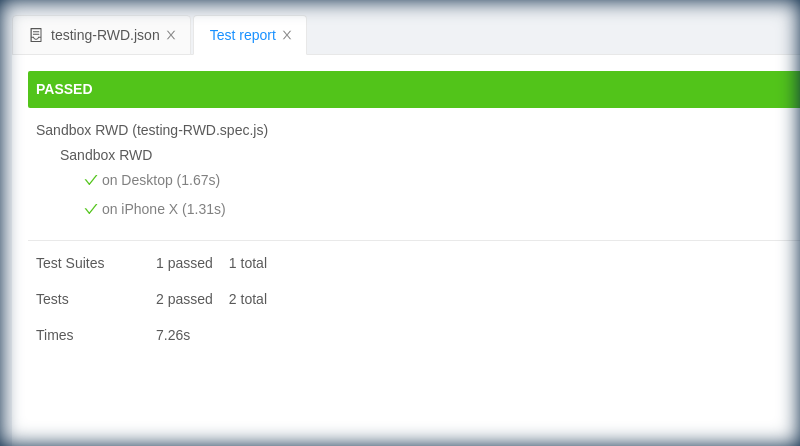
We run tests (F6) and get the report.